|
|
Post by mattwrc on Oct 25, 2005 18:36:46 GMT
i prefere logo number 1
|
|
|
|
Post by Curt on Oct 26, 2005 13:57:43 GMT
I originally thought that but I think logo1's text is too bright and big, and won't suit the forum. |
|
jward
Spectator

Posts: 10
|
Post by jward on Oct 26, 2005 22:53:05 GMT
The site should be fully functional now. The last bt of code - the related articles system - will go up tomorrow. I would email but I've lost my address book.
|
|
|
|
Post by Mitch on Oct 27, 2005 6:25:19 GMT
I like both logos!! ;D
|
|
|
|
Post by Curt on Oct 27, 2005 8:12:33 GMT
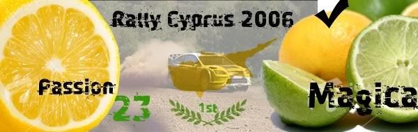
This is how the website will look with the new logo:  Click to enlarge What do you think? |
|
|
|
Post by OverSauron on Oct 28, 2005 18:02:37 GMT
I like the new design very much!!! Like a cosy cafe with a cup of coffee in the hand, surrounded by good friends... Great!!!
|
|
|
|
Post by Vivski on Oct 29, 2005 3:21:56 GMT
I still think the banner should not be so tall. Could be 2/3rds that height, bring the url and email address closer together, squish the yellow decoration a bit, still needs a rallying wheel. I'd prefer it to be more rallying oriented and for the line to be more representative of a stage winding through scenery... like this... www.virtualspectator.com/demos/VS_Flyover-1.wmvBut that's just my preference. Site looks good. |
|
|
|
Post by Curt on Oct 29, 2005 10:27:26 GMT
I think you are right Viv, all those changes would make the site looks much better, but I don't have the graphic design skills to do any of them. I will contact the web designer and see whether he would mind, unless someone else fancies a go?
|
|